Get In Touch
hello@untangld.co
Get In Touch
hello@untangld.co
Follow
|
LinkedIn


I’m embarrassed to say that I think I’ve been reading correspondence brand maps wrong for most of my career.
According to Tim Bock, founder of DisplayR, this is how you read a traditional brand map:
I stopped at the mention of cosine.
Instead they recommend Moonplots.
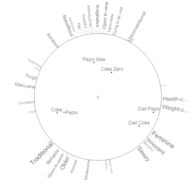
This is much more intuitive.
Anything that makes data more intuitive is a win.
So check out more on Moonplots and the original DisplayR article here.

→ Danish is one of the most awarded strategists in the world, having worked on some of the most iconic brands in the last decade including Virgin Atlantic, Coca Cola, and Volvo. Danish spent his career helping to make modern, connected strategy integral to world-class effective work. A co-founder of Untangld, and a founding partner of By The Network, Danish is also a regular judge at the Effies and WARC Global Effectiveness Awards and a contributor to popular industry rags.